How much of a song's popularity is actually written into its audio features — and how much is just noise?
This was the final project for STT 810 — Mathematical Statistics for Data Scientists, a course in the M.S. Data Science program taught by Dr. Paul Speaker. Working with a partner, Chris Grandy, I set out to predict a track's popularity from a Spotify dataset of roughly 20,000 songs and 15 numerical and categorical features.
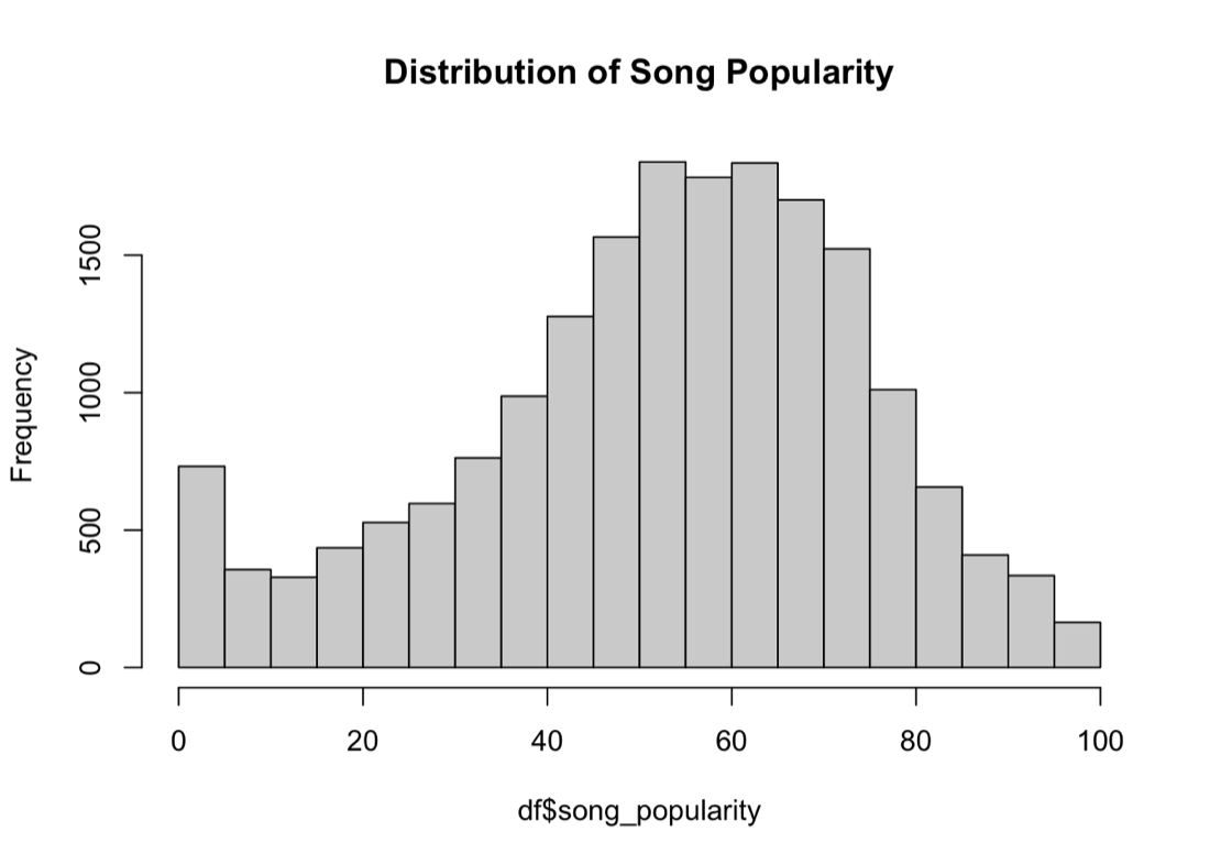
The approach
We treated it as a supervised learning problem, built entirely in R. The pipeline ran from exploratory analysis and feature engineering through visualization and modeling, validated on a 70/30 train–test split. Along the way we leaned on the standard R toolkit for this kind of work:
- Wrangling & stats: dplyr, tidyverse, MASS, caTools
- Correlation & visualization: ggplot2, corrplot, Plotly, patchwork
The final model used a small, deliberate set of predictors — energy, key, and speechiness — which the exploratory work flagged as the features with any real relationship to popularity.
What we found
The honest headline: popularity in this dataset was close to random. Most features carried little signal, and even the best predictors explained only a modest slice of the variance. Rather than force a more complex model to chase noise, we kept the model simple and let the data set the ceiling.
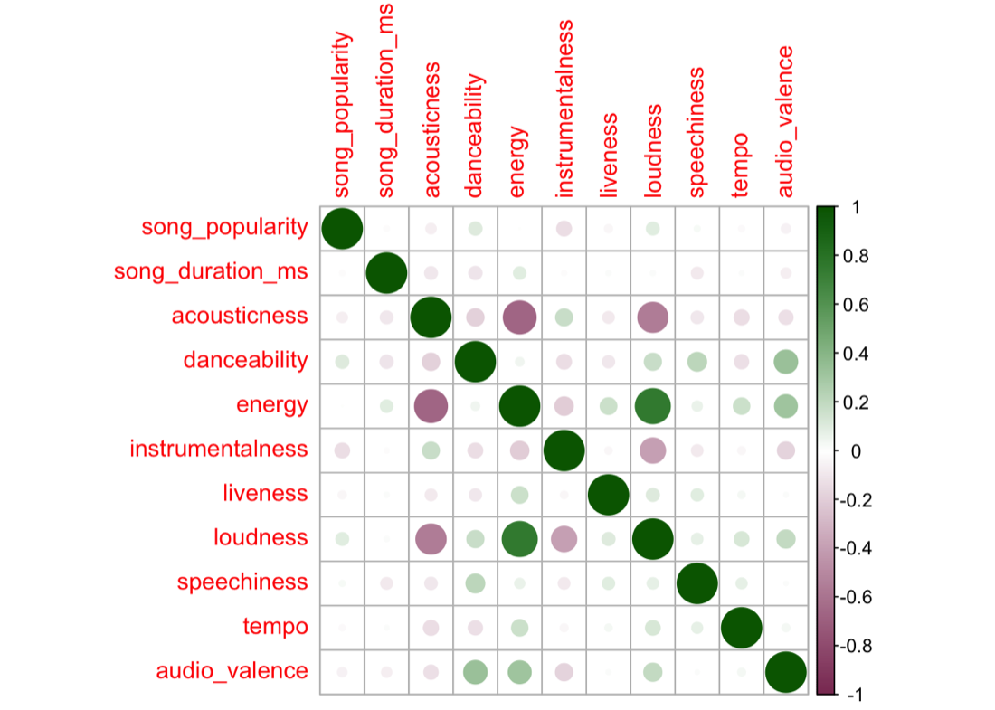
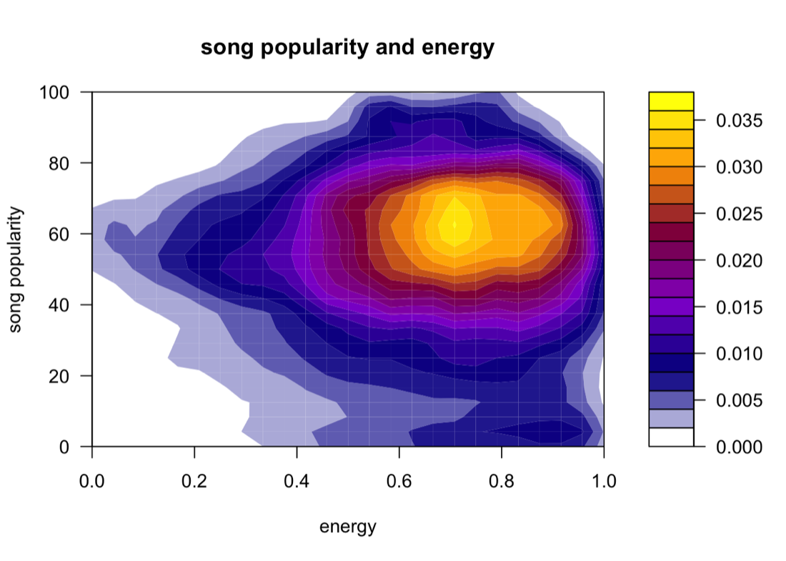
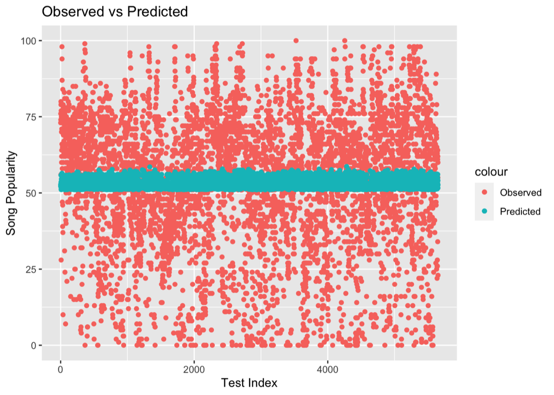
That turned out to be the real lesson of the project — not every question has a strong enough signal to build a genuinely predictive model from, and recognizing that early is its own kind of result. It's a lesson that has stuck with me well beyond the course: interrogate whether the relationship exists before investing in the model that assumes it does.
Data
The dataset came from a public Spotify song popularity collection on Kaggle.